Sunday 20 March 2016

Thursday 10 March 2016

Design Development

 
Changes to the cover
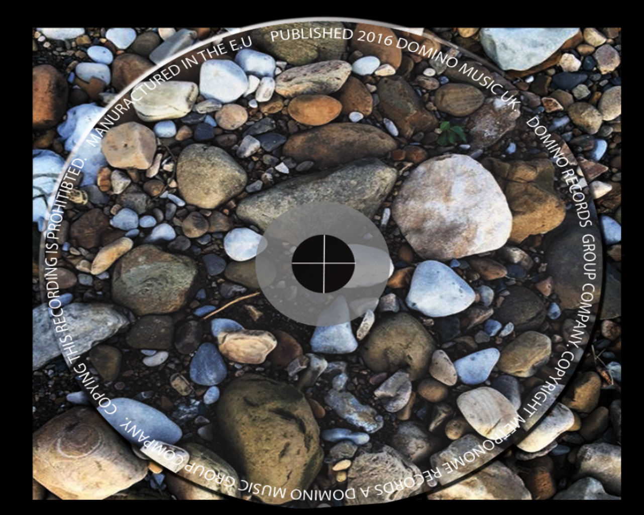
his was my original design I have changed the image filters and style this is because this has allowed me to achieve a bolder style this is because of the change in exposure which has allowed the rocks and other details in the image such as the trees to be shown up more clearly. I have also changed the font into a much bolder style this is because it allows there to be a bolder impact upon the viewer. the use of a formal font is allowing the design to be more readable and does not take any of the attention away from the image which is the main feature on the cover of the design.
 
 
Things kept the same
I have used the same image on the cover of the design because this is a basic yet effective style. the use of a silhouette is good because this is allowing there to not be a main feature in the image and it goes together well. I have kept the amount of text and the location the same this is because I am able to frame the image. the text at the top and bottom of the image allows the design to have an outline to it and this is effective because it helps the image to stand out as the main feature on the page.


Added features
I have included a spine to the design this is effective because this is what enables the Digipak to be identified from its side once it is stacked up in a row. I think that by including this feature it is key because this also allows the viewer to see what the album is and also the other key features that are shown on it. this includes the music website and the link to the page that features the new album that has been released. I think that the used of the smaller features such as the record label logo allows the viewer to seethe key parts and get a feel for what the album is and the genre that it is based around.
 

Monday 22 February 2016

First Draft OF Digipak (with text)


 I will have a simple design to my digipak allowing the images to be the main focus of the design. by design this it is effective because this is allowing the images to appeal to the viewer in their won way. for the cover I will be using a basic style of text that blends in well with the image. on the first inside cover there will be no text and just the shape of two hands this is because this is effective because of the colours around the edges of the hands and the features within the image. instead of using a sleeve for the CD I will have it displayed on a press on section. this will be where the rocks are this is effective because this will allow the design to come off the page where the CD will be placed. for the track list I have used the same front as the album name on the cover cage this is effective because this is allowing there to be a continues style throughout the design. I have used larger text where it says TRACK LIST this is because this is surrounded by the coloured light and the sun in the image. this is good because it allows the text to be highlighted and stand out on the page. this is key because this is creating a focus point on the design. once the focus point s that is the text has been see this is then allowing the viewer to look at the image behind the text. the use of a basic style of imagery with bolder and brighter parts allow the image to be less of a focus point on the screen allowing the text to be the main feature and the image as a secondary feature.

Tuesday 9 February 2016

First Draft Of Digipak (without text)


This is the first of my final mock up I have used the same out door style in all of my images along with similar edits and filters. by doing this it has allowed me to achieve a similar look and style across all of the images. this is effective because this is helping the product to flow together well. I have not decided on the text, font, colour or positioning however I will be using the same style throughout the other platforms of promotion that I will be creating. on my magazine advert I will use the same text and similar style as my digipak.